info@cmjent.com

Website Design
Mobile Friendly Websites
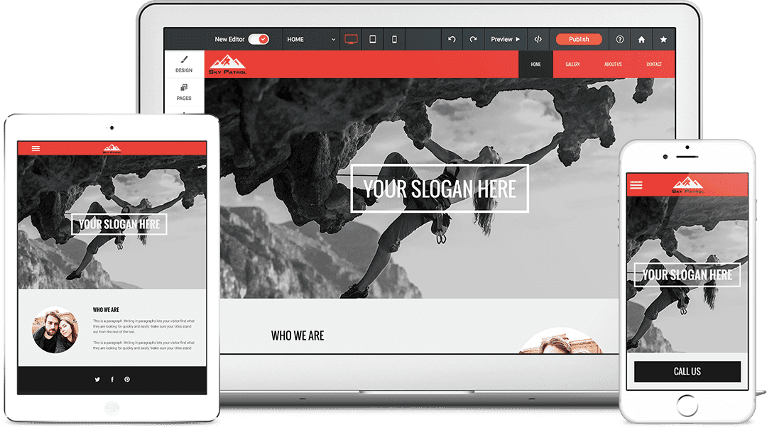
Having a current and mobile friendly website is essential for your business
There is no better way to display what you have to say about your business than your website. With so many people using mobile devices, your website has to be ready for when people are looking. Our cutting edge, Google Preferred website builder will have your website looking professional and with the easy 'Do It Yourself' interface, enables you to have and manage a responsive websites with no need to code.
Our Portfolio
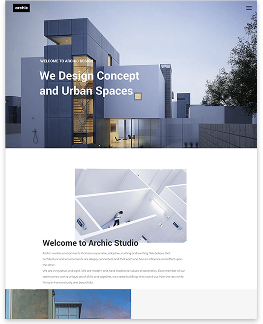
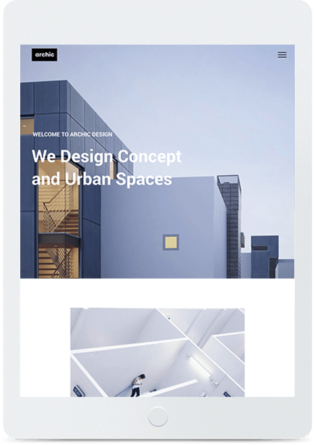
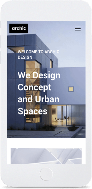
Architect
Custom designed for an architecture firm
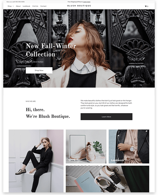
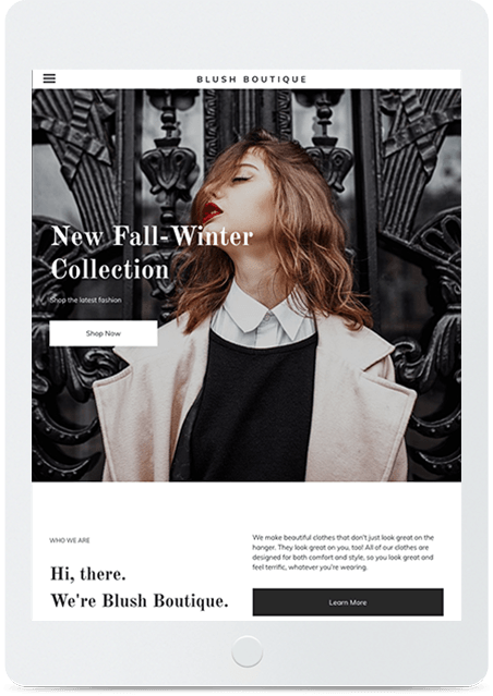

Blush boutique
Perfect for a trendy shop or boutique
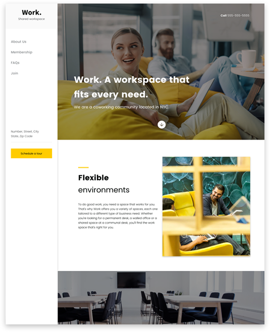
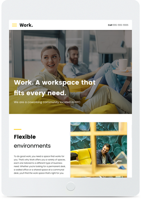
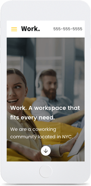
Work
Designed for a shared workspace environment
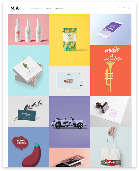
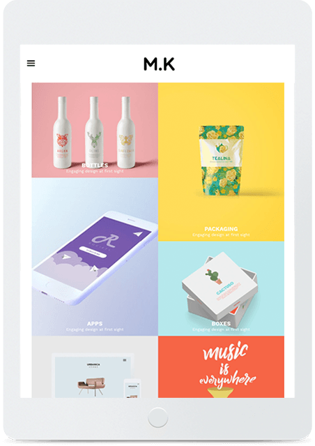

Portfolio
Showcasing for freelance designers
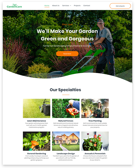
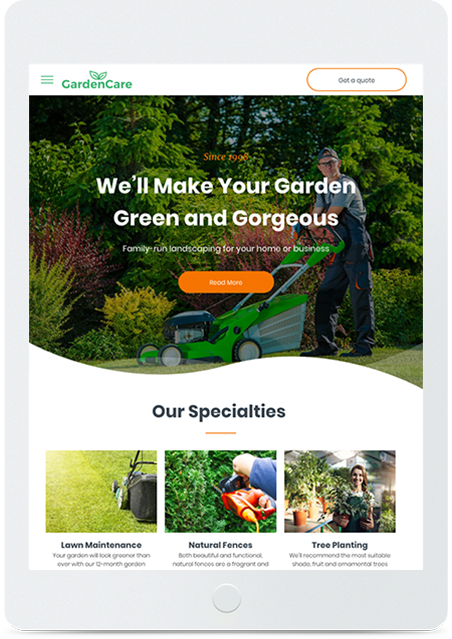

Garden Care
Excellent for any type of service provider
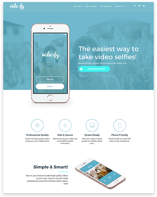
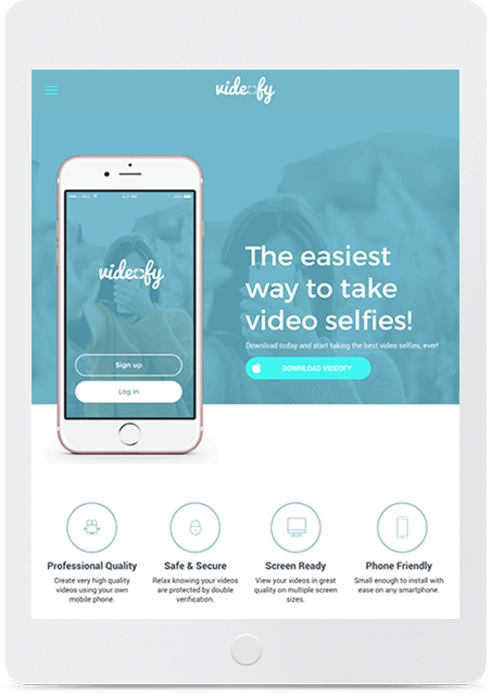

Videofy
Ideal for start-ups and tech companies
Count on Our Services
We know what your small business website needs and we’ll build it right.
Mobile Friendly Design
Don’t worry about the device. We design sites that work perfectly on desktop, tablet, and mobile.
Greatness in Store
Get ready to move more eCommerce. Sell up to 2500 different products in your own online store.
Editing on the Go
Once your site is up and running, you can edit it anytime, anywhere from your mobile device.
Better SEO For YOU
We’ll get your site Google ready with customized SEO. That way, more customers can find you fast.
Hosting with the Most
All of our websites are hosted on Amazon AWS, so count on 99.99% monthly uptime.
Keep ‘Em Coming
Let us design widgets that will help you get more calls, appointments, and customers.
Need help building your website? Contact us to set up an appointment.
Most User Friendly Platform
Here are a few short tutorials for you to get started if you chose our 'Do It Yourself' package. We are always available to help you get your website off the ground.
Basic Editor Tour
Getting comfortable with the tools to edit your site is very important. Here we show you around so you know more about how to navigate through your editor so you can build and customize your responsive site. Learn about great features for customizing your site and widgets you can add to give your site more functionality.
Edit Page Elements
With CMJ Responsive sites, the layout consists of rows that stack on top of each other and columns that are within the rows. This system builds the overall structure of the pages in your site. Within the structure, you further customize your pages by adding widgets to the layout and edit each widget within the page. Learn more about customizing your pages in the tutorial of the inline editor.
Global Design
When designing your site, you may want to make changes that will appear throughout your site in one convenient place. Find out more about the global changes you can make that will cut down on the time it takes to design your site. Here, you can find out where you can change your color scheme, and more.
Manage Pages
Organizing the pages in your site is important because you want the most relevant information to be the most accessible, but you may have lots of subcategories in your site and will need a way to arrange the order and the suborder of your site.
Manage Imported Content
While customizing and designing your site makes your site unique, your content really drives that message home. Importing the text, images and files from your original site is easy with Duda. Learn more about what we can pull in and where you can find it in your editor.
Website Header
The header is an important part of your site that helps to distinguish your site’s identity and what it has to offer. This is where your logo or name will be most prominently placed in your site. This is also where you will find the navigation of your site.